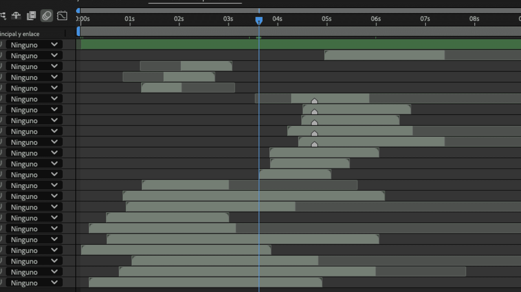
To push the Dardo's VFX skills and attract game studios, we created a custom reel using games built specifically for the demo. I handled the post-production — including editing, transitions, music, and sound design — along with the brand identity and its motion. The reel was part of a broader marketing campaign that included teasers, social media content, and web assets.
Logo
To ensure the VFX truly highlight in the reel, the in-game environments were intentionally designed with minimal contrast — only a few specific elements in the scene draw attention. I've taken this contrast principle into the logo, using contrast as the core visual strategy.


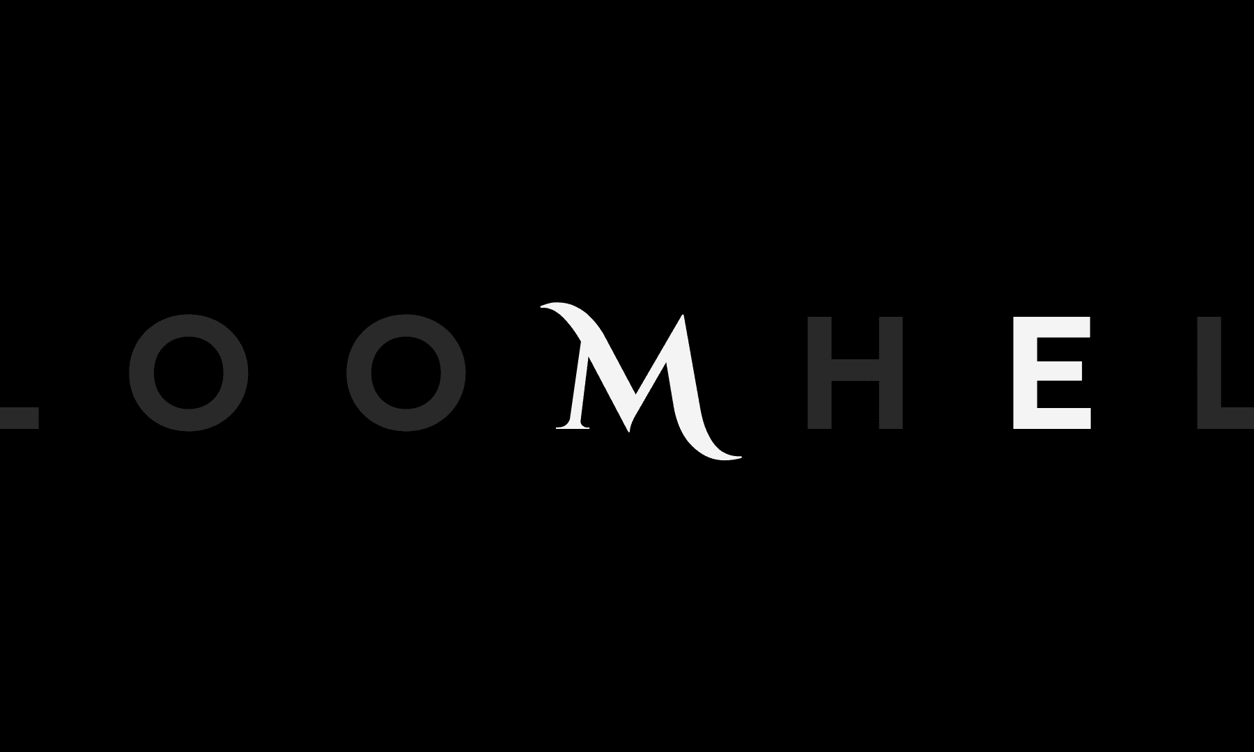
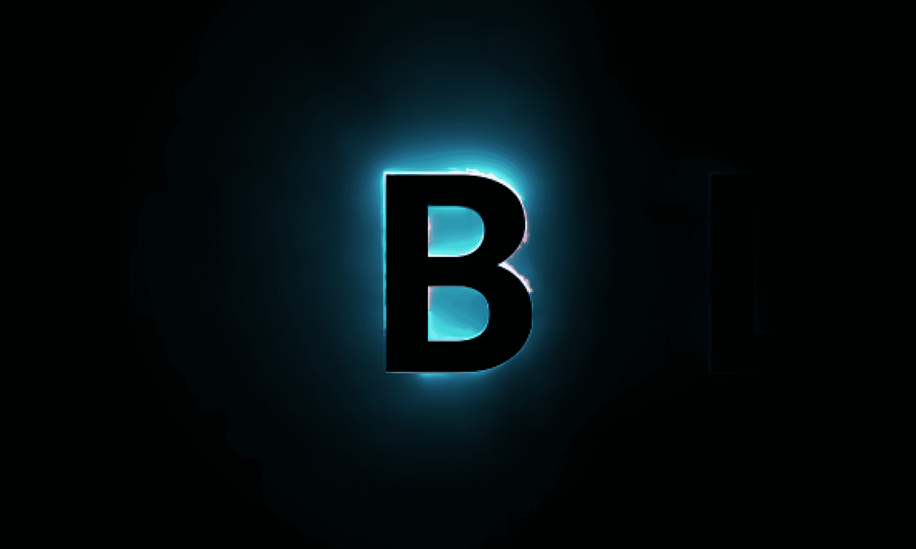
Typographic Contrast
The “M” uses a high-contrast serif style with fine details, standing out against the bold, geometric sans-serif letters — creating visual tension while maintaining balance.
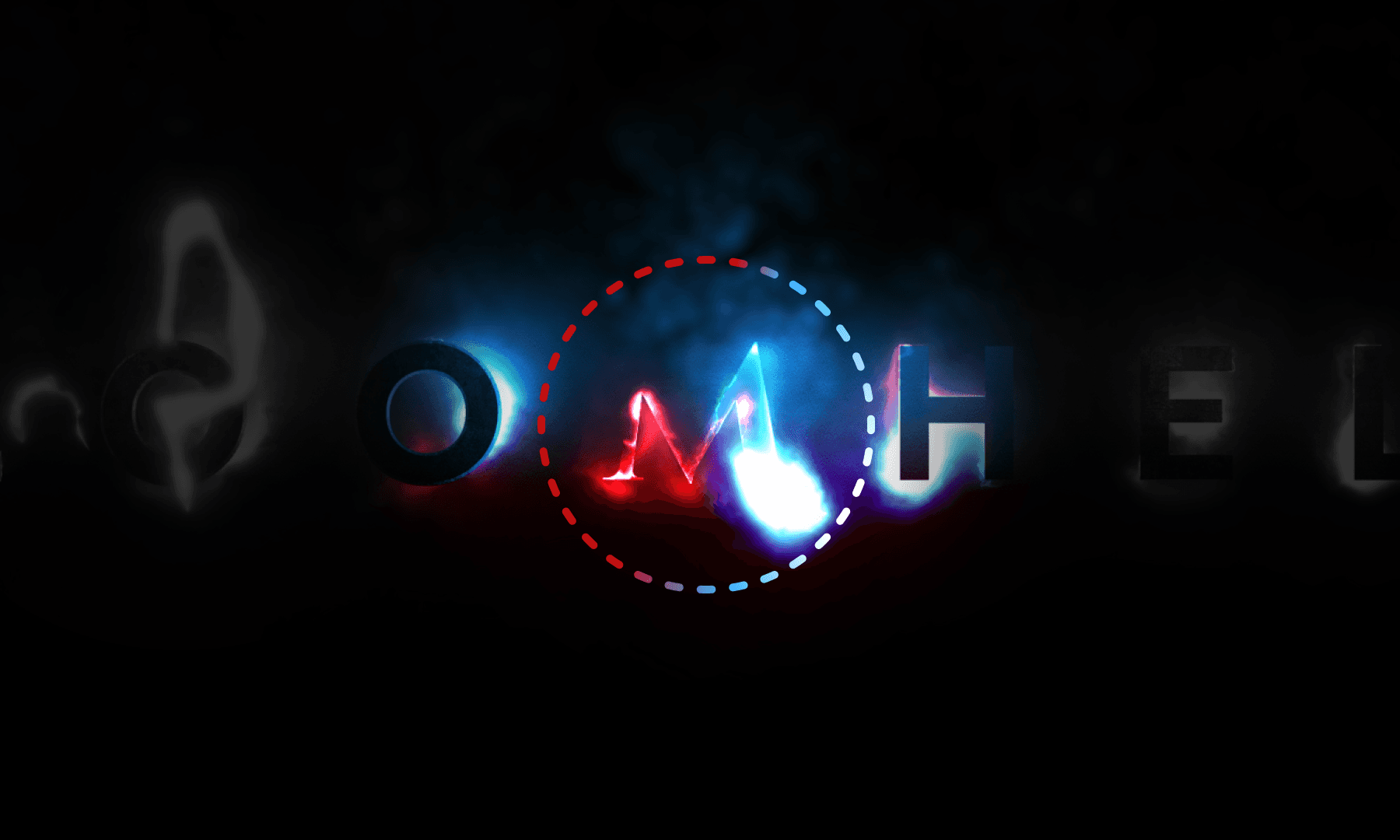
Color Contrast
Red and blue glows introduce a dynamic color contrast, reinforcing the energy of the VFX and drawing the viewer’s eye across the wordmark.
Negative Space
Some letters match the background color, creating negative space. This makes the glowing parts stand out more — just like VFX do in a game.
The Reel
I created the sounds effects to enhance realism and VFX impact. The animated UI, though not designed or animated by me, was integrated in post to support immersion.
A single VFX already carries a lot of sound detail.