As their first anniversary approached, they saw the need for a brand that matched the quality and ambition of their work. The goal was to create a bold, cohesive visual system for their website launch—one that preserved the name Dardo (Dart) and amplified its values: precision, speed, and impact.
Brand Identity
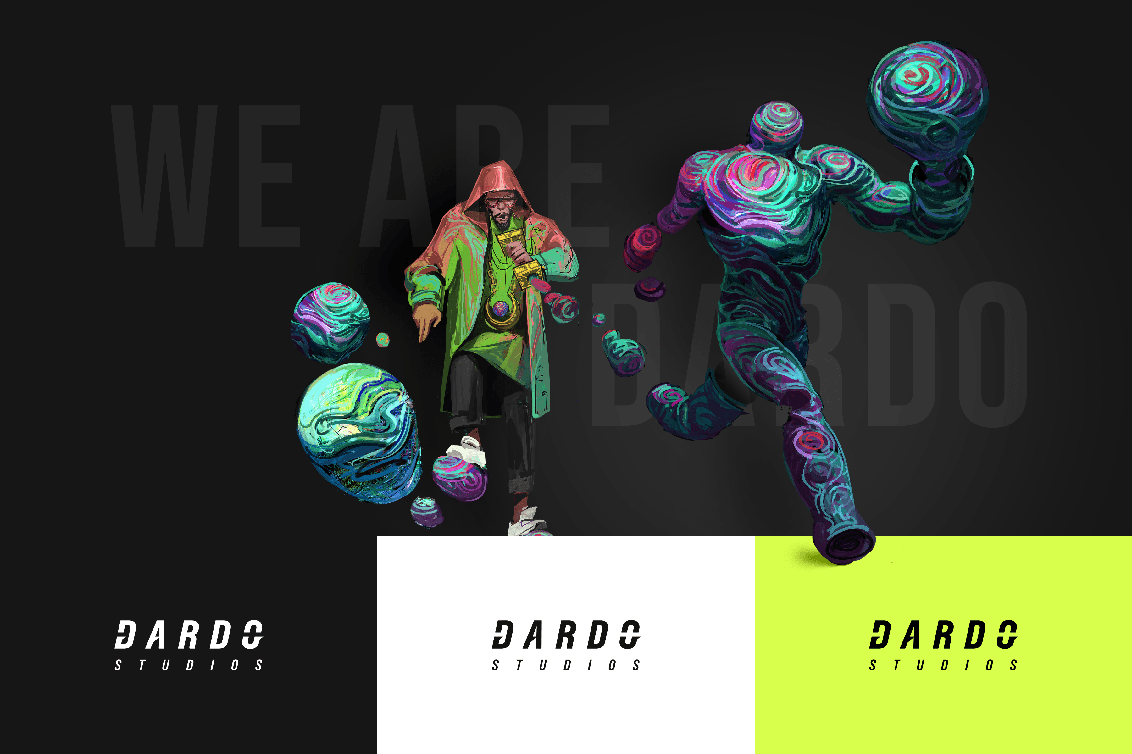
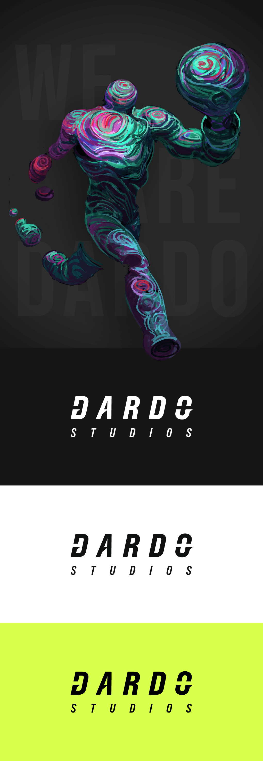
Dardo's logo
Dardo's symbol
The new logo brings the concept to life. The horizontal cuts in the letters represent a dart (Dardo) hitting its target, while the italic slant gives a sense of speed and direction—like the motion left behind after a quick strike. The wider spacing adds to that feeling of movement, creating a rhythm that reflects how the studio works: fast, precise, and focused.
To build a more flexible visual system, I also designed a custom symbol. It’s based on a square to give it weight and balance, and its internal lines subtly represent Dardo’s three main areas: Art Creation, Recruiting, and Consulting. The symbol is strong enough to be used on its own and was created with animation in mind, so it can adapt and evolve depending on the context. It works as both a brand element and a storytelling device, always keeping the brand’s bold personality.

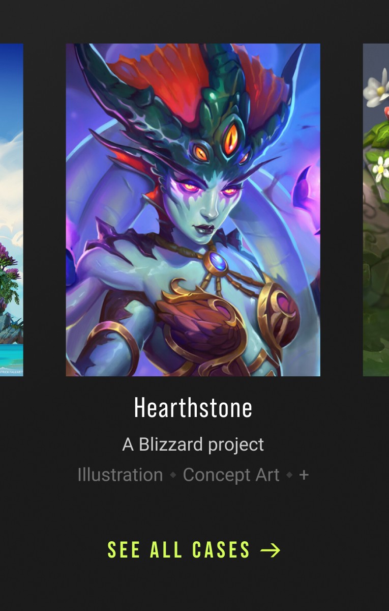
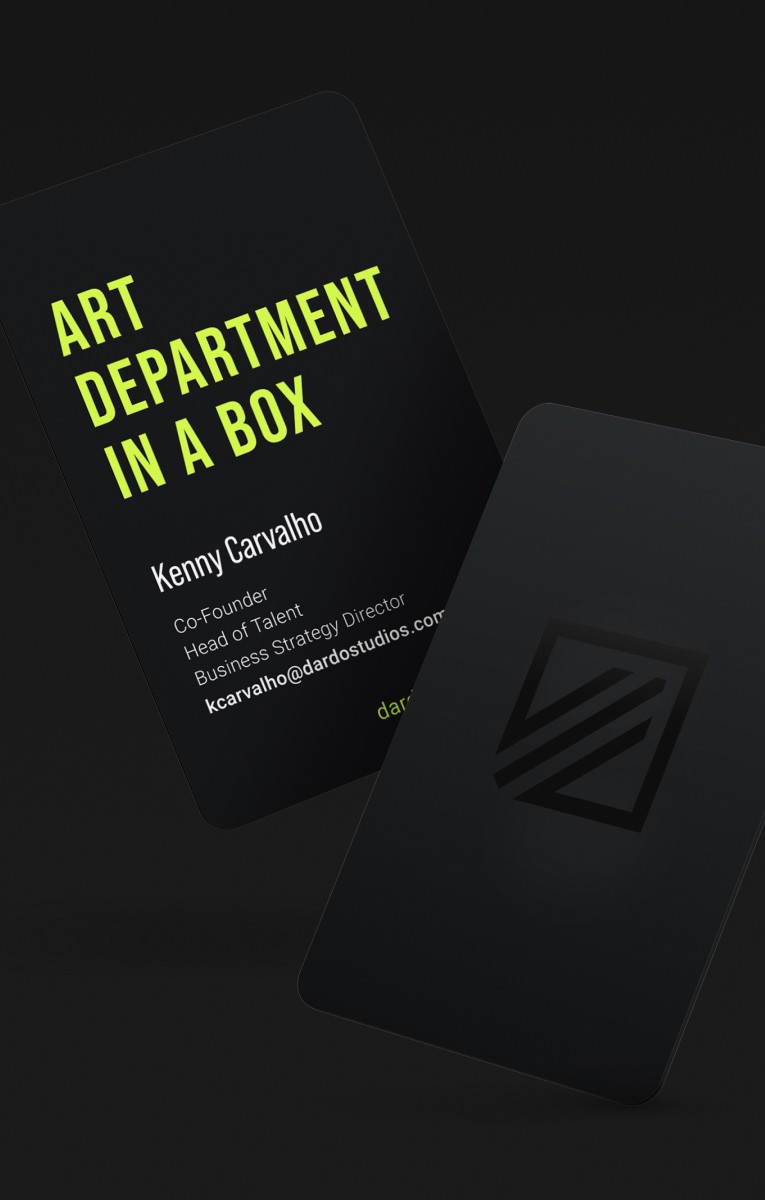
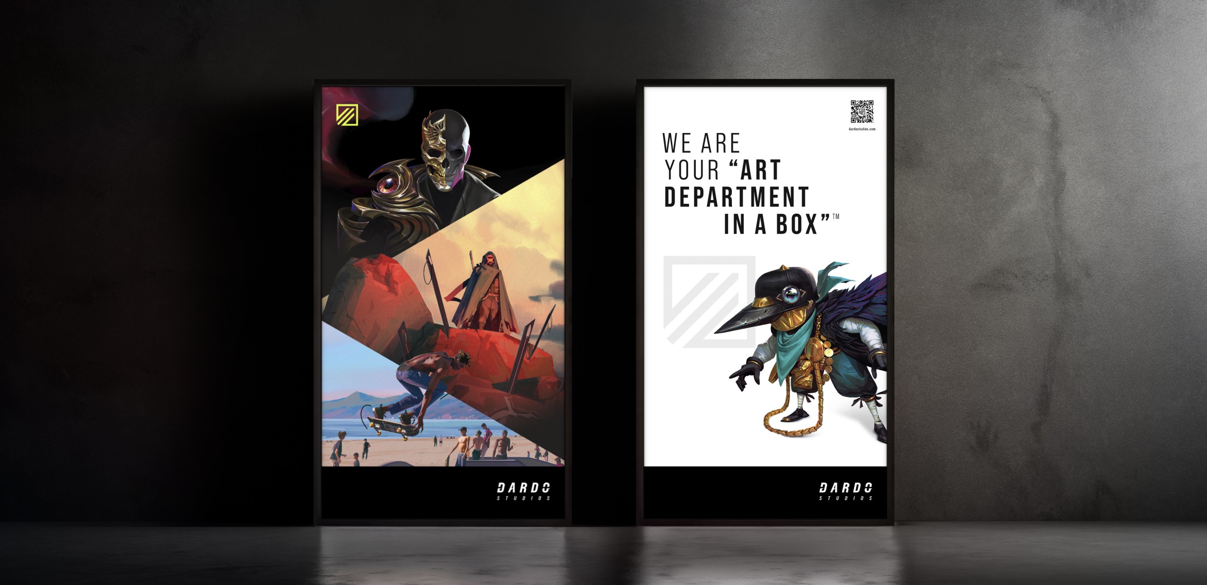
Developed a full brand experience across web, print, social media, and events—blending digital and physical touchpoints seamlessly.
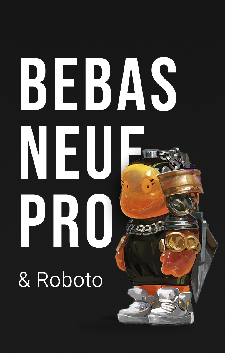
For Dardo’s brand, I chose Bebas Neue Pro for titles and Roboto for body text. This combo creates a clear hierarchy and strong contrast. Bebas brings strength and impact to headlines, matching the bold and expressive visuals in the brand. Roboto is clean and easy to read, making it perfect for longer texts and digital use.
The main colors are black and white, picked for their timeless look, accessibility, and ability to let the artwork take the spotlight. To add energy, I introduced a bright acid accent color that highlights important messages or details. This sharp contrast reflects Dardo’s values—precision, speed, and impact—and helps guide the viewer’s attention in a clear and intentional way.
Brand Expression


Linkedin post

Job offer banner
Instagram post cover
20%
Instagram Engagement
Industry Average (1.16%)
3.5%
Google Search CTR
Industry Average (~2%)
From logo animations to experimental reels, motion design adds energy, emotion, and storytelling to the Dardo universe.
Motion played a key role in bringing the Dardo brand to life. I developed the motion language by animating the logo, symbol, and graphic elements, giving the identity rhythm, personality, and depth. This animated system was essential to making the brand feel dynamic and contemporary.
As part of this work, I created a main brand reel to showcase the visual universe of Dardo in motion. In addition, I produced various motion pieces for internal projects like the Edgar's one or Bloomhell VFX reel for instance, using movement to explore new storytelling angles and visual experiments within the Dardo ecosystem. Each animation followed the brand’s expressive tone while adapting to the unique character of each subproject.